
Setting up a heat map isn't just about splashing some color onto your webpage. It's about turning clicks and scrolls into real, actionable business intelligence. A good heat map gives you a direct window into what your visitors love, what frustrates them, and exactly where they get stuck.
Why Heat Maps Are Your Secret Weapon for Growth
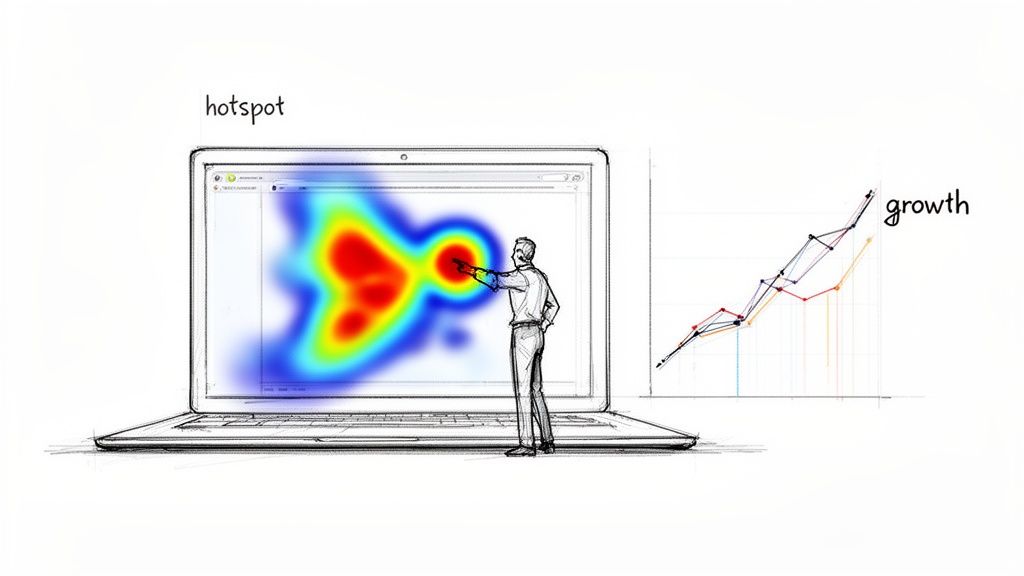
Before we get into the how-to, it’s critical to understand why heat maps are a core growth strategy. Think of it as the ultimate focus group—one where users show you their true intentions through their behavior, not just what they think you want to hear.
This visual data answers questions that standard analytics can't touch. Your analytics might show a high bounce rate on a key landing page, but a heat map shows you why. Maybe visitors are rage-clicking a non-interactive element, or they scroll right past your main call-to-action because it’s buried "below the fold."
From 19th-Century Paris to Modern Marketing
This whole idea of using color to show data density isn't new. It actually dates back to 1873, when a French statistician used a shaded grid to visualize social data across different districts of Paris. That same core concept now helps us map the modern digital customer journey.
Today, that principle helps businesses unlock powerful insights. For a growing company, this isn't just theory; it's a direct path to more revenue.
By visually mapping user engagement, you can identify "hot" spots of high intent and "cold" spots where interest dies. This intelligence is the foundation for making data-driven improvements that directly boost conversions.
Actionable Intelligence for Every Team
The insights from a good heat map ripple across your entire organization, connecting website performance to tangible business outcomes.
For Marketers: Pinpoint which headlines and images grab the most attention to sharpen your messaging and creative assets.
For Sales Teams: See which features or pricing tiers generate the most interest, giving you powerful context for follow-up calls.
For Product Designers: Watch how users actually interact with new features, instantly revealing usability issues or even unexpected use cases.
Instead of seeing it as a technical chore, view creating a heat map as a strategic imperative. It closes the gap between raw numbers and genuine customer empathy. For example, finding out that visitors on your pricing page consistently hover over a specific feature is gold for your next email marketing campaign.
Choosing the Right Heat Map Tool for Your Business
Picking a heat map tool can feel like a chore. There are dozens of them out there, from simple website plugins to full-blown analytics platforms, and they all promise the world.
The trick is to find one that actually fits your goals—not just grab the most popular option. Above all, you need to create a heat map that gives you clean, reliable data without wrecking your site speed. A slow tracking script can kill the very user experience you’re trying to improve.
Key Features For Growing Businesses
Don't get sidetracked by flashy features that you'll never use. For a growing business, the best tools balance powerful insights with genuine ease of use.
Here’s what you should actually look for:
Dynamic and Static Heat Maps: Static maps are fine for simple, unchanging pages. But for modern sites with pop-ups, menus, and other interactive bits, you need a tool that can track clicks on those dynamic elements.
Session Replays: Heat maps show you what users do in aggregate, while session replays show you why an individual user did it. Nothing beats watching a real person get stuck on your checkout form. It’s far more eye-opening than a cold spot on a click map.
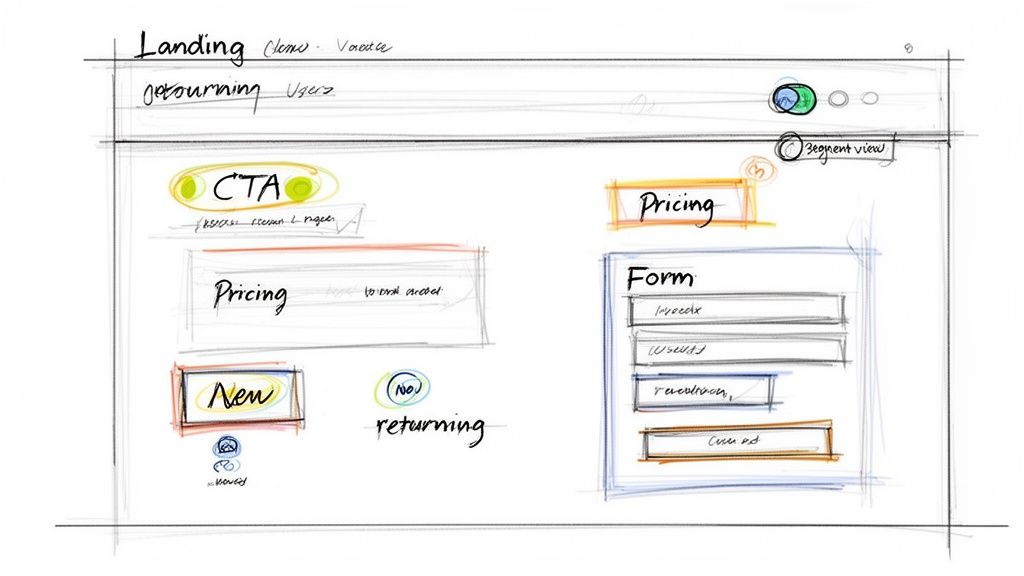
Segmentation and Filtering: Your data is only useful if you can slice it. You absolutely must be able to filter traffic from different sources (like Google Ads vs. organic search) or segment by behavior (like new vs. returning visitors).
The biggest mistake I see is choosing a tool that's a data silo. If your heat map platform can't connect to your CRM, you're missing the whole point. You need to tie on-site behavior directly to sales outcomes to turn clicks into revenue.
Comparing Heat Map Tool Features For SMBs
For small and medium-sized businesses, every tool has to pull its weight. You need maximum impact without a steep learning curve or an enterprise price tag. As you narrow down your choices, think about how each tool will fit into your day-to-day workflow, not just its feature list.
This table breaks down what really matters for an SMB.
Feature | Why It Matters For SMBs | Look For This |
|---|---|---|
Site Speed Impact | A slow tool tanks your user experience and can even hurt your SEO rankings. | Tools that use asynchronous loading for their tracking scripts so they don't block your page from rendering. |
Ease of Installation | You don’t have an IT department on standby to handle a complicated setup. | A simple copy-paste JavaScript snippet or a one-click plugin for your CMS. |
CRM Integration | This is what connects user behavior to actual customer profiles and sales pipelines. | Native integrations with the CRMs you already use, or at least a robust API you can work with. |
Data Sampling | Some tools only track a percentage of your traffic to keep their own costs down, which can skew your data. | Check the traffic limits and sampling rates for each pricing tier. Don't get stuck with a tool that only shows you half the picture. |
Support Quality | When something breaks, you need fast, competent help to get your data flowing again. | Look for responsive chat support, clear documentation, and helpful onboarding guides. |
Ultimately, the best tool is the one you’ll actually use. For businesses looking to connect user behavior to real marketing automation and visitor intelligence, that seamless integration is everything.
Getting this choice right is the first and most important step. It’s the foundation for creating a heat map that truly sharpens your strategy.
Setting Up Your First High-Impact Heat Map
Once your tracking code is installed, the real work begins. The biggest rookie mistake I see is slapping a heat map on the homepage and calling it a day. While that’s a start, it’s like fishing in the ocean without knowing where the fish are.
The goal isn't just to get colorful data—it's to answer specific business questions. Don’t start by asking, “What does this heat map show?” Instead, start with, “What do I need to know about my users?” That simple shift changes everything.
Identify Your Critical Pages
Before you configure anything, you need to pinpoint the pages that directly impact your business goals. These are your high-leverage assets, where small tweaks can lead to big returns.
Your list of critical pages will probably include:
High-Traffic Landing Pages: The first impression for users coming from an ad campaign or organic search.
Pricing or Product Pages: Where prospects make crucial value judgments before deciding to buy.
Checkout or Sign-up Funnels: Any multi-step process where drop-offs directly cost you revenue or leads.
Key Feature Adoption Pages: Areas within your app where you need to drive user engagement.
Once you have this list, you can move from broad observation to focused investigation. For example, instead of a generic homepage heat map, you could set one up specifically on your pricing table to see which plan gets the most attention and clicks.
A heat map without a clear question is just a pretty picture. A heat map designed to understand why 70% of users abandon your three-step checkout form is a powerful diagnostic tool.
Define Your Objective for Each Map
For every single heat map you create, define one clear objective. This sharpens your focus and makes interpreting the results a whole lot easier. Your objective is the "why" behind the map.
Here are a few goal-oriented scenarios I've seen work well:
Objective: Understand form abandonment on the contact page.
Action: Run a click map and a scroll map. This shows you which fields cause hesitation and where people just give up and stop scrolling.
Objective: Measure engagement with a new feature announcement banner.
Action: A simple click map will tell you if the banner is getting clicks or if it's being completely ignored.
Objective: See how new visitors from a paid ad interact with a landing page.
Action: Create a segmented heat map showing only the traffic from that specific ad campaign.
This targeted approach ensures you’re not just passively collecting data but actively hunting for answers.
Segmenting your views is where the real magic happens. Comparing the behavior of "new visitors" versus "returning customers" can reveal wildly different interaction patterns on the exact same page. This gives you a much richer story than a single, aggregated view ever could, and it's the key to making decisions that actually move the needle.
How to Collect Data You Can Actually Trust
Garbage in, garbage out. It's an old saying, but it’s especially true for heat maps. If you act on flawed or incomplete data, you’re not just wasting time—you’re actively making bad decisions. Building confidence in your heat map starts with collecting data you can actually rely on.
One of the first questions people ask is, "How much traffic do I really need to analyze a heat map?" There's no magic number, but I’ve found a good rule of thumb is at least 2,000-3,000 pageviews for the specific page you’re tracking. Make sure you hit that number for each device type (desktop, mobile, and tablet) you care about. Anything less, and you're just guessing based on the random clicks of a few visitors.
Filter Out the Noise
Your raw data is always messy. Before you can find any real insights, you have to clean out the “noise” from user sessions that don’t represent your actual customers.
Here are the most common culprits you need to exclude:
Internal Traffic: Your own team clicking around the site isn't customer behavior. Most heat map tools let you block traffic from specific IP addresses. Use it to filter out your office IPs and the home IPs of your remote employees.
Bot and Crawler Traffic: Most tools are decent at filtering out known bots, but some always slip through. Keep an eye out for sessions with bizarre behavior, like a user clicking ten different buttons in a fraction of a second. That's a bot.
Staging or Test Environments: This is a classic mistake. Always double-check that your tracking script isn't running on development servers where your team is building or testing new features.
Filtering this noise is a non-negotiable step for a clean data set. Getting your inputs right is a core part of building a reliable workflow for your data analysis.
Patience is your best friend here. Don't jump to conclusions after a single day of data. User behavior changes dramatically between weekdays and weekends, or even based on the time of day.
Let the Data Mature
To get a full, accurate picture, you have to let your heat map run long enough to capture natural behavior. I recommend a minimum of one full week, but two weeks is even better. This helps average out any weird spikes from a one-off marketing campaign, a holiday, or just a slow Tuesday.
For example, B2B users are often most active from Tuesday to Thursday during business hours. E-commerce shoppers, on the other hand, might browse on weeknights and make most of their purchases over the weekend. Capturing that full cycle is the only way to create a heat map that shows how your real customers behave, not just how they acted on one particular day.
How to Read Click, Scroll, and Movement Maps

Once your data is flowing, you’ve hit the most important part: turning those colorful splotches into actual business intelligence. This is where you start connecting dots between user behavior and real-world outcomes.
Each map tells a different part of your user’s story. The trick is to layer these stories together to build a complete picture of what works on your page and what’s causing friction. It’s never about one single insight; it’s about combining clues from different maps to find the truth.
Decoding Click Maps for User Intent
Click maps are the most direct type of heat map, showing you exactly where people click. Hot spots (red, orange, yellow) are areas with a high concentration of clicks, while cold spots (blue, green) get little to no interaction.
But reading a click map is more than just spotting the most popular button. The real gold is finding where your expectations don’t match reality.
Here’s what I look for:
"Rage Clicks": These show up as dense, fiery hot spots on a single element. It’s a dead giveaway for user frustration—they’re hammering on something they think should be interactive, but isn't.
"Dead Clicks": Look for clicks on non-linked images, headlines, or icons. This tells you users expect these elements to be clickable, handing you an easy win to add a link and improve navigation.
Primary CTA Engagement: Is your main call-to-action a brilliant red hot spot, or is it ice cold? Low engagement here is a five-alarm fire that needs immediate attention.
On a pricing page I worked on once, we saw a huge cluster of clicks on a feature description but almost none on the "Sign Up" button right below it. That told us users were looking for more information before they’d commit. We added a simple pop-over with more details on that feature, and the sign-up rate jumped.
Interpreting Scroll Maps for Attention Span
A scroll map shows you exactly how far down the page your visitors get. The colors fade from hot at the top to cold at the bottom, showing the percentage of users who reach each part of the page.
Your job is to find the significant drop-off points. If 80% of users see the top of your page but only 20% make it to your key value props halfway down, you’ve got a major attention problem.
A sudden color change from hot red to cool blue on a scroll map reveals what we call a "false bottom." This is often a design element—like a wide banner or an awkward block of white space—that tricks users into thinking the page has ended, so they stop scrolling before they ever see your crucial content below.
Look at where the major color shifts happen. Does it happen right before your testimonials? Or maybe just above your pricing table? This helps you pinpoint which sections are failing to hold interest. You might need to move critical information higher up or rewrite a section to be more compelling.
Reading Movement Maps to Follow the Eyes
Movement maps, sometimes called attention maps, track where users move and hover their mouse. While it’s not a perfect substitute for true eye-tracking, there's a strong correlation between where the mouse goes and where the user is looking.
These maps show you the path of consideration. You might see a user’s cursor hover over three different pricing plans before they finally click one, revealing their decision-making process in real time.
Scan Patterns: Look for broad, sweeping movements to see how users scan your content. This can confirm whether your headlines and subheadings are effectively guiding their eyes down the page.
Points of Hesitation: A cursor that lingers over a form field or a button for a long time before moving on signals confusion. This could mean your field label is unclear or the button text isn't compelling enough.
By combining all three maps, you can diagnose user behavior with incredible accuracy. A scroll map might show a drop-off, a movement map could show a lack of attention in that same section, and a click map might reveal users clicking a non-linked image out of frustration. Together, they tell a clear story and give you a path to a solution.
Turning Heat Map Insights Into Revenue
Insights are worthless if they just sit in a dashboard. The real work begins when you turn those hard-won observations into tangible actions that actually fuel your sales and marketing engine.
This is where visual data gets translated directly into revenue. Your goal is to build a closed-loop system where website analytics actively inform your growth plays. Don’t let your heat map become just another report; make it the starting point for smarter customer engagement.
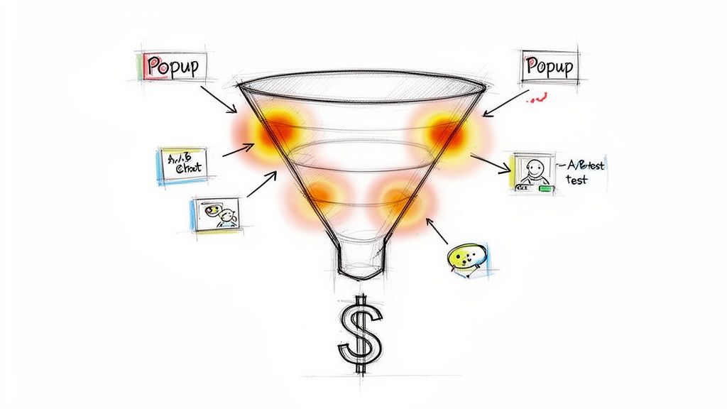
From Hot Spots to A/B Tests
Your heat map findings are the perfect foundation for building powerful A/B test hypotheses. Instead of guessing what to change on a page, you can base your tests on proven user behavior.
Here’s a real-world example:
Observation: Your click map shows users are ignoring the primary "Request a Demo" button but are heavily clicking a case study link nearby.
Hypothesis: Changing the button text from "Request a Demo" to "See It in Action" will better align with user intent and increase clicks.
Action: Run an A/B test with the new button copy and measure the conversion lift.
This data-driven approach removes all the subjectivity. You're no longer debating opinions in a meeting room; you're letting actual user behavior guide your optimization efforts.
By operationalizing your heat map data, you transform it from a passive report into an active playbook for growth. A "hot spot" on a pricing feature isn't just an observation—it's a sales signal telling you what to talk about next.
Automate Engagement Based on Behavior
Modern marketing automation platforms let you trigger actions based on specific website interactions. This is where your heat map insights can become incredibly powerful.
Imagine your scroll map shows a major drop-off right before your pricing table. This is a classic signal of hesitation or a loss of interest.
Instead of just losing that lead, you can create a targeted intervention:
Set Up a Trigger: Configure a pop-up or a slide-in chat prompt that appears when a user scrolls to that specific drop-off point and hesitates for more than a few seconds.
Offer Proactive Help: The prompt could say, "Have questions about our pricing? Our team is here to help."
Capture the Lead: This simple, context-aware interaction can re-engage a user who was about to leave, turning potential abandonment into a real sales conversation.
Similarly, if your heat map on a sign-up form reveals that 60% of users abandon the form after reaching the "Company Size" field, you can create an automated email sequence. This flow could trigger for anyone who starts the form but doesn’t finish, re-engaging them with a simpler call to action or a direct link to a sales rep.
Enrich CRM Profiles with Behavioral Data
Your heat map data also provides rich context that can be fed directly into your CRM. Knowing what a specific prospect clicked on or lingered over gives your sales team a massive advantage. This level of detail is also crucial for better understanding what your ad-hoc reporting means for your overall strategy.
For example, if a known lead from your CRM visits your site and their session replay shows them repeatedly clicking on a specific feature, that behavioral data is gold.
You can sync this activity to their CRM profile, allowing your sales team to tailor their follow-up call. They can focus on the exact features the prospect showed interest in, turning a cold follow-up into a highly relevant conversation.
By unifying heat map insights with your sales and marketing tools, you create a powerful system for growth. Stamina’s all-in-one platform makes this connection seamless, allowing you to turn website visitor behavior into automated outreach and enriched CRM profiles that help you close more deals. Learn more at stamina.io.

