How to Embed a Video in an Email: Proven Methods

Learn how to embed a video in an email with proven methods. Compare inline playback, GIFs, and linked thumbnails for better engagement.

0 - Minute Read

Most advice on how to embed a video in an email starts with the wrong goal. True inline playback sounds impressive, but in real inboxes it's usually the least reliable path, and often the most expensive one in terms of testing, fallback work, and accessibility cleanup. The better question is whether the email should contain a playable video at all, or whether a linked thumbnail will do the job with far less risk.

Why Most Video Embeds Fail in Email
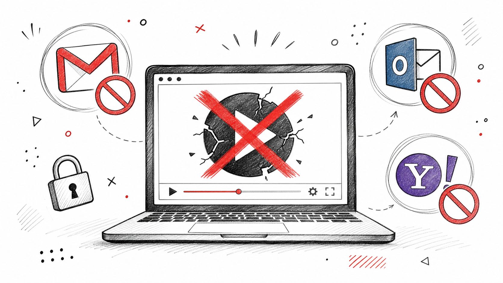
A pencil sketch of a laptop displaying a broken video icon with blocked email icons nearby.

The workflow that looks like a video embed is usually a compromise. Major guides point marketers toward a thumbnail, GIF, or poster image linked to a hosted video because email-client support is limited, and the file has to stay light enough to fit email use (Validity). That constraint matters because email is built to display lightweight assets, not to stream media.

What happens in the inbox

HTML video tags get described as if they work everywhere. They do not. Gmail, Outlook, Yahoo, and similar clients often strip, block, or ignore inline playback, which leaves marketers with a fallback image anyway. The practical pattern is to build for the clients that will not play video, then host the asset on a platform that can handle playback while the email shows a poster image and fallback behavior where support exists.

Practical rule: if the email still works when the video never plays, you've built it correctly.

The problem is usually the success metric. Email teams want the message itself to feel interactive, but subscribers care about load speed, rendering accuracy, and whether the path to the content is simple. That is why many practitioners settle on a hybrid pattern, host the video externally, place a thumbnail or GIF in the email, and send the click to the full video.

The hidden cost people skip

The trade-off is not just compatibility. It is the extra QA load, the odds of rendering surprises, and the accessibility work needed to make motion understandable when playback never starts. A video-heavy email can look polished in one client and break in another, so the question is less about whether it can be embedded and more about whether it should be.

If the main objective is deliverability-safe engagement, a linked image is often the stronger starting point than a true video block. If you are also cleaning up sender reputation or inbox placement issues, it helps to review whitelist an email tactics alongside your media strategy, because even a well-built thumbnail will not help if the message never lands.

Comparing the Three Main Embedding Methods

The three common approaches solve different problems, and they do not carry the same risk. A clickable thumbnail is the safest choice for broad delivery. An animated GIF gives you motion without asking the inbox to play media. An HTML5 video tag gets closest to inline playback, but it asks for the most and still gives you the least consistency across clients.

Video Embedding Method Comparison

Method

Client Support

File Size

Load Time

Best For

Clickable thumbnail image

Broad support across major email clients

Light

Fast

Reliable campaigns, broad audiences, most transactional uses

Animated GIF

Broad support, though motion is not the same as playback

Can grow quickly if not optimized

Usually faster than true video, slower than a static image

Teasers, product demos, short motion cues

Inline HTML5 video tag

Limited and inconsistent by client

Best kept under 10 MB for email use (Validity)

Slowest and most failure-prone

Narrow audiences with known client support

The choice usually starts with your audience mix. If much of your list opens in clients that do not reliably support video playback, native embed turns into extra work with little upside. The practical default is still the same one many teams end up using, host the video externally and show a poster image in the email, then let playback happen where the client supports it.

How to choose without guessing

If your audience is mixed, choose the thumbnail. If your audience is narrowly controlled, test GIF or HTML5 video.

That rule is simple because the trade-offs are simple. A thumbnail works almost everywhere and gives you a clean click path to a hosted player. A GIF can be stronger when the point of the email is visual demonstration, but it can also become heavy and distracting if the clip runs too long. HTML5 video is only worth the extra QA when you know the client distribution and have the time to support the edge cases.

For a more basic benchmark on plain-text versus visual rendering trade-offs, the comparison in HTML vs text email is useful context. Video adds another layer to that same decision, because every visual flourish has to earn its place in the inbox.

The biggest mistake is treating all three methods as equal options. They are not. One is a stable delivery pattern, one is a motion cue, and one is a technical experiment with real maintenance overhead.

Building a Clickable Thumbnail That Works Everywhere
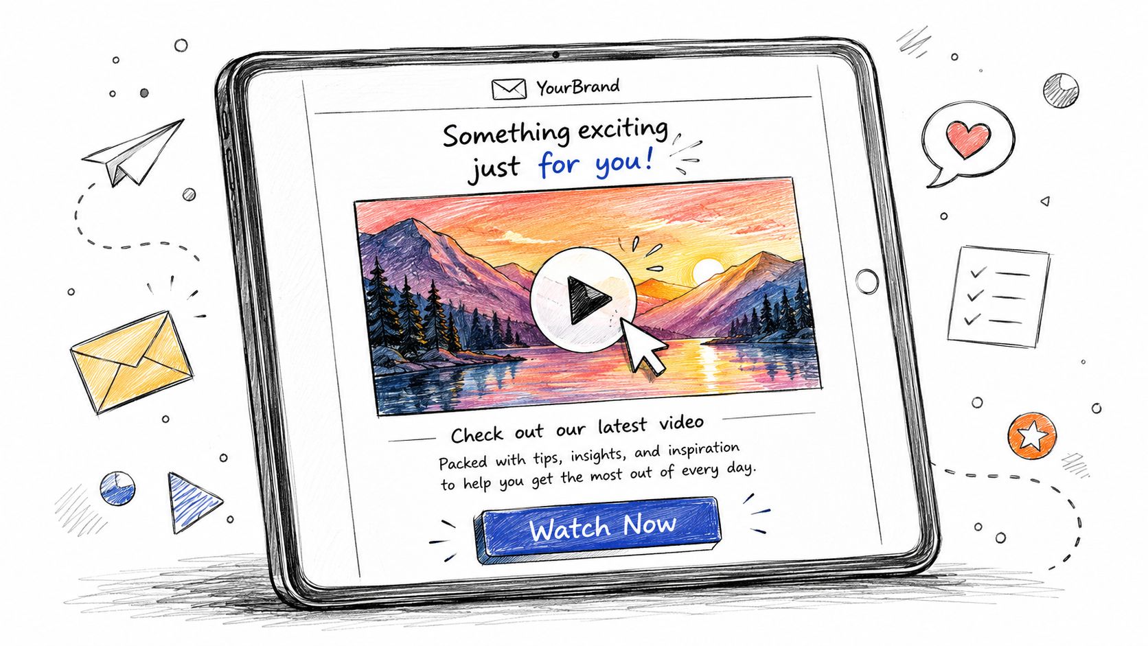
A digital illustration showing a tablet screen displaying an email newsletter featuring an embedded video play button.

The most dependable method is also the least glamorous. Create a strong still frame, overlay a play icon, and link the image to a hosted landing page or video player. That's the version that survives Gmail, Outlook, Apple Mail, and mobile clients without special handling.

Build the image like a CTA, not a screenshot

A thumbnail is not just a preview. It's a call to action in image form. Use a frame with one clear focal point, enough contrast for small screens, and a play icon that's large enough to read without effort. Keep the file lean, because the goal is to open quickly, not to impress people with an oversized visual.

A simple implementation looks like this:

<a href="https://your-hosted-video-page.example" target="_blank" rel="noopener"><img src="https://your-thumbnail.example/video-thumb.jpg" alt="Watch the product demo video" style="display:block;width:100%;max-width:600px;height:auto;border:0;"></a>

That structure works because the link is on the image itself, which keeps the experience obvious. If you want better tracking, send the click to a dedicated landing page instead of the raw media file so the event can be measured in your analytics stack.

Make the thumbnail feel intentional

Use the surrounding copy to explain why the video matters, not just that it exists. A strong email tells the reader what they'll learn, then the thumbnail gives them a direct path. That's where the copy matters as much as the image itself, and copywriting for email is the piece many teams overlook when they focus only on media placement.

A good thumbnail should look like the first scene of the video, not an afterthought pulled from a folder.

Accessibility matters here too. The alt text should describe the action, not the design. “Watch the 45-second product walkthrough” is more useful than “video image” because it gives screen reader users the same intent that sighted users get from the play icon. Keyboard navigation should also land on the image link cleanly, which keeps the CTA usable without a mouse.

For responsive rendering, keep the image fluid with width:100% and a sensible max-width, then test the crop on mobile. Broken image links, tiny play icons, and poster frames that lose their focal point on a phone are the most common self-inflicted problems. If the thumbnail doesn't communicate the value instantly, the click rate suffers before the video even has a chance.

Using Animated GIFs and Inline HTML5 Video

GIFs sit in the middle. They give you motion inside the email without depending on a client to play real video, which makes them a practical choice when a static thumbnail feels too flat but you still care about inbox reliability. HTML5 video is the more fragile option. Use it only when the client mix justifies the maintenance work and the fallback path is already planned.

When a GIF beats a static image

A GIF earns its place when movement is the point. Product UI, a short feature reveal, or a quick visual cue can work better when the image shifts just enough to suggest action. The trade-off is file size, and that trade-off matters fast, because a heavy GIF can slow the email and erase the benefit you were trying to create.

Keep the animation short and focused. A few seconds of looped motion is usually enough to show the idea, and the last frame still needs to make sense if the animation stalls or gets flattened by the client. That keeps the asset useful even when motion is blocked.

A GIF also gives you a safer path when the email needs some movement but not full playback. For teams trying to raise engagement without inflating load time, Ecommerce Boost engagement tactics is a useful reminder that the click path matters more than the novelty of the format. In practice, the stronger choice is often the one that loads quickly and still makes the next action obvious.

HTML5 video only makes sense with fallback planning

Inline HTML5 video needs a poster image and a fallback for clients that ignore playback. The safest setup is to host the video externally and use the poster frame as the visual anchor where the tag is supported. Native support is narrow, so the fallback has to carry real weight instead of acting like an afterthought.

A basic pattern looks like this:

<video controls poster="https://your-poster.example/poster.jpg" width="600" height="338"><source src="https://your-video.example/video.mp4" type="video/mp4"><a href="https://your-hosted-video-page.example">Watch the video</a></video>

That markup is only part of the job. The host has to be dependable, the file should stay light, and the email must still read clearly if the video tag is ignored. In most campaigns, the poster image ends up doing the heavy lifting, which is why it needs to be chosen with the same care as the video itself.

If you can't explain the fallback in one sentence, the video probably isn't worth shipping.

The decision also depends on the broader email strategy. If you're already working to improve inbox performance, this format should support that goal, not distract from it. A good internal benchmark is whether the message still works cleanly on its own, even before the video is considered. If it does not, the email is carrying too much risk for too little gain.

Use GIFs when you want light motion and a lower support burden. Use HTML5 only when you have a narrow client set, a tested poster image, and a clear reason to accept the extra upkeep. Anything else belongs in the thumbnail bucket.

Deliverability, Accessibility, and Testing Best Practices

Video doesn't hurt deliverability by magic. The problems come from what teams do around it, oversized assets, broken links, poor text-to-image balance, and layouts that render unpredictably in different clients. If a campaign lands with a heavy visual block and little supporting text, spam filters and human readers both have less reason to trust it.

Test the email the way subscribers will actually see it

The safest workflow is to test rendering, link behavior, and accessibility before you send anything to the full list. Litmus and Email on Acid are useful for previewing client differences, but manual checks still matter because real inboxes reveal quirks that previews miss. Open the email in Gmail, Outlook, Apple Mail, and a mobile client, then verify that the thumbnail, play icon, and fallback text all survive.

The accessibility checklist should be simple and ruthless. The thumbnail needs descriptive alt text, the play control should be obvious visually, and any motion should be understandable even if animation is blocked. If you use a GIF or autoplay-like motion, make sure the surrounding copy tells the story without depending on movement alone.

Don't let media hide the message

Video often distracts teams from the core metric, which is whether the email helps the subscriber take the next step. If the video is the only content in the message, a broken fallback becomes a dead end. If the email includes a clear headline, supporting text, and a strong CTA, the video becomes an enhancement rather than a dependency.

For teams refining inbox placement and engagement at the same time, improve UX with Otter A/B is a helpful reminder that device compatibility belongs in the testing process, not as an afterthought. That's especially true for video, where tiny rendering differences can change whether the CTA is obvious or invisible.

The practical checklist is short:

  • Check the fallback first. If the email is still understandable without video, the structure is sound.

  • Keep the visual asset lean. Large files slow the message and create more points of failure.

  • Confirm keyboard and screen reader behavior. The play area should still function as a link.

  • Validate every destination URL. A thumbnail to a dead page is worse than no video at all.

If you've already got open-rate work in progress, the tactics in how to improve email open rates should sit alongside your media decisions, because engagement starts before the click. Video can help, but only if the email earns the open in the first place.

Scaling Video Email with Strategy and Automation

The best video campaigns aren't built around the media. They're built around a testable reason to use it. In one send, a thumbnail might outperform a GIF because the offer is simple. In another, motion might win because the value is visual and immediate. The point is to measure the role of video, not assume it.
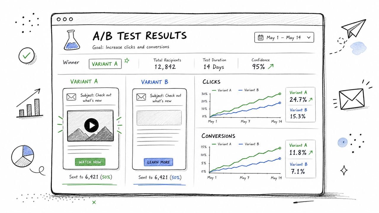
An illustration showing A/B test results comparing email marketing variants with video content and standard links.

Test the content, not just the format

A/B testing should isolate the choice that matters. Compare a static thumbnail against a GIF. Compare a thumbnail linked to a landing page against one linked to a direct video page. Keep the subject line and core offer stable so the result reflects the media decision instead of a dozen moving parts.

That logic matters in sales outreach, nurture, and onboarding alike. A prospect who already knows the brand may respond to a short personalized video, while a new subscriber may need a clean thumbnail and a faster route to the explanation. There isn't one universal winner, because the audience's intent changes the value of motion.

Track the journey beyond the click

Clicks alone are useful, but they don't tell the whole story. Use tagged links, dedicated landing pages, and downstream conversion tracking so you can see whether the video improved quality, not just curiosity. A high click rate with weak follow-through usually means the thumbnail made a promise the video didn't keep.

Personalized video scales best when the workflow is controlled. That can mean segmenting by lifecycle stage, sending different thumbnails to different personas, or using automation to insert the right video into the right sequence. The more specific the use case, the easier it is to decide whether the complexity is justified.

Use video when it clarifies the next step, not when it merely decorates the email.

A practical rule is to reserve richer video treatments for messages where the visual explanation is the actual value. Product demos, onboarding walkthroughs, and customer education can justify more complexity than a routine broadcast. When the message is mostly informational, a strong image and concise copy usually win on speed and reliability.

For teams that want a single system for broadcasts, automated flows, CRM data, and personalized outreach, Stamina can help centralize the workflow around one source of truth. If you're ready to stop guessing whether video belongs in the send and start testing it against real pipeline outcomes, use that setup to build, measure, and refine the next campaign.

Most advice on how to embed a video in an email starts with the wrong goal. True inline playback sounds impressive, but in real inboxes it's usually the least reliable path, and often the most expensive one in terms of testing, fallback work, and accessibility cleanup. The better question is whether the email should contain a playable video at all, or whether a linked thumbnail will do the job with far less risk.

Why Most Video Embeds Fail in Email

A pencil sketch of a laptop displaying a broken video icon with blocked email icons nearby.

The workflow that looks like a video embed is usually a compromise. Major guides point marketers toward a thumbnail, GIF, or poster image linked to a hosted video because email-client support is limited, and the file has to stay light enough to fit email use (Validity). That constraint matters because email is built to display lightweight assets, not to stream media.

What happens in the inbox

HTML video tags get described as if they work everywhere. They do not. Gmail, Outlook, Yahoo, and similar clients often strip, block, or ignore inline playback, which leaves marketers with a fallback image anyway. The practical pattern is to build for the clients that will not play video, then host the asset on a platform that can handle playback while the email shows a poster image and fallback behavior where support exists.

Practical rule: if the email still works when the video never plays, you've built it correctly.

The problem is usually the success metric. Email teams want the message itself to feel interactive, but subscribers care about load speed, rendering accuracy, and whether the path to the content is simple. That is why many practitioners settle on a hybrid pattern, host the video externally, place a thumbnail or GIF in the email, and send the click to the full video.

The hidden cost people skip

The trade-off is not just compatibility. It is the extra QA load, the odds of rendering surprises, and the accessibility work needed to make motion understandable when playback never starts. A video-heavy email can look polished in one client and break in another, so the question is less about whether it can be embedded and more about whether it should be.

If the main objective is deliverability-safe engagement, a linked image is often the stronger starting point than a true video block. If you are also cleaning up sender reputation or inbox placement issues, it helps to review whitelist an email tactics alongside your media strategy, because even a well-built thumbnail will not help if the message never lands.

Comparing the Three Main Embedding Methods

The three common approaches solve different problems, and they do not carry the same risk. A clickable thumbnail is the safest choice for broad delivery. An animated GIF gives you motion without asking the inbox to play media. An HTML5 video tag gets closest to inline playback, but it asks for the most and still gives you the least consistency across clients.

Video Embedding Method Comparison

Method

Client Support

File Size

Load Time

Best For

Clickable thumbnail image

Broad support across major email clients

Light

Fast

Reliable campaigns, broad audiences, most transactional uses

Animated GIF

Broad support, though motion is not the same as playback

Can grow quickly if not optimized

Usually faster than true video, slower than a static image

Teasers, product demos, short motion cues

Inline HTML5 video tag

Limited and inconsistent by client

Best kept under 10 MB for email use (Validity)

Slowest and most failure-prone

Narrow audiences with known client support

The choice usually starts with your audience mix. If much of your list opens in clients that do not reliably support video playback, native embed turns into extra work with little upside. The practical default is still the same one many teams end up using, host the video externally and show a poster image in the email, then let playback happen where the client supports it.

How to choose without guessing

If your audience is mixed, choose the thumbnail. If your audience is narrowly controlled, test GIF or HTML5 video.

That rule is simple because the trade-offs are simple. A thumbnail works almost everywhere and gives you a clean click path to a hosted player. A GIF can be stronger when the point of the email is visual demonstration, but it can also become heavy and distracting if the clip runs too long. HTML5 video is only worth the extra QA when you know the client distribution and have the time to support the edge cases.

For a more basic benchmark on plain-text versus visual rendering trade-offs, the comparison in HTML vs text email is useful context. Video adds another layer to that same decision, because every visual flourish has to earn its place in the inbox.

The biggest mistake is treating all three methods as equal options. They are not. One is a stable delivery pattern, one is a motion cue, and one is a technical experiment with real maintenance overhead.

Building a Clickable Thumbnail That Works Everywhere

A digital illustration showing a tablet screen displaying an email newsletter featuring an embedded video play button.

The most dependable method is also the least glamorous. Create a strong still frame, overlay a play icon, and link the image to a hosted landing page or video player. That's the version that survives Gmail, Outlook, Apple Mail, and mobile clients without special handling.

Build the image like a CTA, not a screenshot

A thumbnail is not just a preview. It's a call to action in image form. Use a frame with one clear focal point, enough contrast for small screens, and a play icon that's large enough to read without effort. Keep the file lean, because the goal is to open quickly, not to impress people with an oversized visual.

A simple implementation looks like this:

<a href="https://your-hosted-video-page.example" target="_blank" rel="noopener"><img src="https://your-thumbnail.example/video-thumb.jpg" alt="Watch the product demo video" style="display:block;width:100%;max-width:600px;height:auto;border:0;"></a>

That structure works because the link is on the image itself, which keeps the experience obvious. If you want better tracking, send the click to a dedicated landing page instead of the raw media file so the event can be measured in your analytics stack.

Make the thumbnail feel intentional

Use the surrounding copy to explain why the video matters, not just that it exists. A strong email tells the reader what they'll learn, then the thumbnail gives them a direct path. That's where the copy matters as much as the image itself, and copywriting for email is the piece many teams overlook when they focus only on media placement.

A good thumbnail should look like the first scene of the video, not an afterthought pulled from a folder.

Accessibility matters here too. The alt text should describe the action, not the design. “Watch the 45-second product walkthrough” is more useful than “video image” because it gives screen reader users the same intent that sighted users get from the play icon. Keyboard navigation should also land on the image link cleanly, which keeps the CTA usable without a mouse.

For responsive rendering, keep the image fluid with width:100% and a sensible max-width, then test the crop on mobile. Broken image links, tiny play icons, and poster frames that lose their focal point on a phone are the most common self-inflicted problems. If the thumbnail doesn't communicate the value instantly, the click rate suffers before the video even has a chance.

Using Animated GIFs and Inline HTML5 Video

GIFs sit in the middle. They give you motion inside the email without depending on a client to play real video, which makes them a practical choice when a static thumbnail feels too flat but you still care about inbox reliability. HTML5 video is the more fragile option. Use it only when the client mix justifies the maintenance work and the fallback path is already planned.

When a GIF beats a static image

A GIF earns its place when movement is the point. Product UI, a short feature reveal, or a quick visual cue can work better when the image shifts just enough to suggest action. The trade-off is file size, and that trade-off matters fast, because a heavy GIF can slow the email and erase the benefit you were trying to create.

Keep the animation short and focused. A few seconds of looped motion is usually enough to show the idea, and the last frame still needs to make sense if the animation stalls or gets flattened by the client. That keeps the asset useful even when motion is blocked.

A GIF also gives you a safer path when the email needs some movement but not full playback. For teams trying to raise engagement without inflating load time, Ecommerce Boost engagement tactics is a useful reminder that the click path matters more than the novelty of the format. In practice, the stronger choice is often the one that loads quickly and still makes the next action obvious.

HTML5 video only makes sense with fallback planning

Inline HTML5 video needs a poster image and a fallback for clients that ignore playback. The safest setup is to host the video externally and use the poster frame as the visual anchor where the tag is supported. Native support is narrow, so the fallback has to carry real weight instead of acting like an afterthought.

A basic pattern looks like this:

<video controls poster="https://your-poster.example/poster.jpg" width="600" height="338"><source src="https://your-video.example/video.mp4" type="video/mp4"><a href="https://your-hosted-video-page.example">Watch the video</a></video>

That markup is only part of the job. The host has to be dependable, the file should stay light, and the email must still read clearly if the video tag is ignored. In most campaigns, the poster image ends up doing the heavy lifting, which is why it needs to be chosen with the same care as the video itself.

If you can't explain the fallback in one sentence, the video probably isn't worth shipping.

The decision also depends on the broader email strategy. If you're already working to improve inbox performance, this format should support that goal, not distract from it. A good internal benchmark is whether the message still works cleanly on its own, even before the video is considered. If it does not, the email is carrying too much risk for too little gain.

Use GIFs when you want light motion and a lower support burden. Use HTML5 only when you have a narrow client set, a tested poster image, and a clear reason to accept the extra upkeep. Anything else belongs in the thumbnail bucket.

Deliverability, Accessibility, and Testing Best Practices

Video doesn't hurt deliverability by magic. The problems come from what teams do around it, oversized assets, broken links, poor text-to-image balance, and layouts that render unpredictably in different clients. If a campaign lands with a heavy visual block and little supporting text, spam filters and human readers both have less reason to trust it.

Test the email the way subscribers will actually see it

The safest workflow is to test rendering, link behavior, and accessibility before you send anything to the full list. Litmus and Email on Acid are useful for previewing client differences, but manual checks still matter because real inboxes reveal quirks that previews miss. Open the email in Gmail, Outlook, Apple Mail, and a mobile client, then verify that the thumbnail, play icon, and fallback text all survive.

The accessibility checklist should be simple and ruthless. The thumbnail needs descriptive alt text, the play control should be obvious visually, and any motion should be understandable even if animation is blocked. If you use a GIF or autoplay-like motion, make sure the surrounding copy tells the story without depending on movement alone.

Don't let media hide the message

Video often distracts teams from the core metric, which is whether the email helps the subscriber take the next step. If the video is the only content in the message, a broken fallback becomes a dead end. If the email includes a clear headline, supporting text, and a strong CTA, the video becomes an enhancement rather than a dependency.

For teams refining inbox placement and engagement at the same time, improve UX with Otter A/B is a helpful reminder that device compatibility belongs in the testing process, not as an afterthought. That's especially true for video, where tiny rendering differences can change whether the CTA is obvious or invisible.

The practical checklist is short:

  • Check the fallback first. If the email is still understandable without video, the structure is sound.

  • Keep the visual asset lean. Large files slow the message and create more points of failure.

  • Confirm keyboard and screen reader behavior. The play area should still function as a link.

  • Validate every destination URL. A thumbnail to a dead page is worse than no video at all.

If you've already got open-rate work in progress, the tactics in how to improve email open rates should sit alongside your media decisions, because engagement starts before the click. Video can help, but only if the email earns the open in the first place.

Scaling Video Email with Strategy and Automation

The best video campaigns aren't built around the media. They're built around a testable reason to use it. In one send, a thumbnail might outperform a GIF because the offer is simple. In another, motion might win because the value is visual and immediate. The point is to measure the role of video, not assume it.

An illustration showing A/B test results comparing email marketing variants with video content and standard links.

Test the content, not just the format

A/B testing should isolate the choice that matters. Compare a static thumbnail against a GIF. Compare a thumbnail linked to a landing page against one linked to a direct video page. Keep the subject line and core offer stable so the result reflects the media decision instead of a dozen moving parts.

That logic matters in sales outreach, nurture, and onboarding alike. A prospect who already knows the brand may respond to a short personalized video, while a new subscriber may need a clean thumbnail and a faster route to the explanation. There isn't one universal winner, because the audience's intent changes the value of motion.

Track the journey beyond the click

Clicks alone are useful, but they don't tell the whole story. Use tagged links, dedicated landing pages, and downstream conversion tracking so you can see whether the video improved quality, not just curiosity. A high click rate with weak follow-through usually means the thumbnail made a promise the video didn't keep.

Personalized video scales best when the workflow is controlled. That can mean segmenting by lifecycle stage, sending different thumbnails to different personas, or using automation to insert the right video into the right sequence. The more specific the use case, the easier it is to decide whether the complexity is justified.

Use video when it clarifies the next step, not when it merely decorates the email.

A practical rule is to reserve richer video treatments for messages where the visual explanation is the actual value. Product demos, onboarding walkthroughs, and customer education can justify more complexity than a routine broadcast. When the message is mostly informational, a strong image and concise copy usually win on speed and reliability.

For teams that want a single system for broadcasts, automated flows, CRM data, and personalized outreach, Stamina can help centralize the workflow around one source of truth. If you're ready to stop guessing whether video belongs in the send and start testing it against real pipeline outcomes, use that setup to build, measure, and refine the next campaign.

Share this article

Share this article

Send a shareable link to your team or anyone who might find it useful.

Send a shareable link to your team or anyone who might find it useful.

Copy link

Copied

Share directly to

Table of contents

Give Your Business the Stamina it needs to Thrive

PRODUCT

COMPANY

RESOURCES

© 2026 Stamina Software Technologies Inc. All rights reserved.

PRODUCT

COMPANY

RESOURCES

© 2026 Stamina Software Technologies Inc. All rights reserved.

PRODUCT

COMPANY

RESOURCES

© 2026 Stamina Software Technologies Inc. All rights reserved.